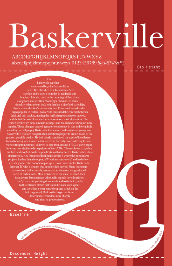
This was a project for our Page Layout course during our first semester. Everyone was randomly assigned a different font family, then had to create a poster showcasing it.
The requirements were to create a rationale about it, include every letter to showcase the font, and to use some typography terminology such as “Baseline” and “Cap Height”.
As you can see, I was assigned the Baskerville font. I decided to go for more of a book style, as well as highlighting its unique letter “Q”. I didn’t really have any meaning behind the color red in the background, I just thought it would look “elegant” and would fit a fancy book cover.