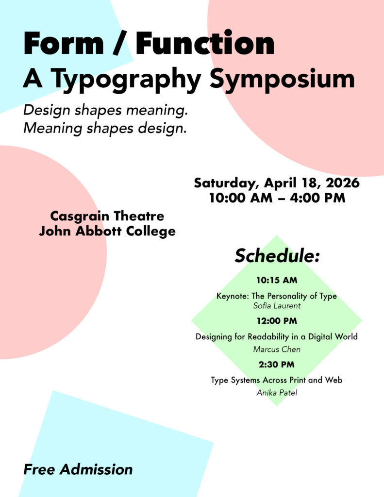
This was an assignment for our second semester’s Typography course. Every person had to choose a different style, like minimalism which I landed on. Then, we were given a text document containing all the information for an event. Our goal was to make a poster, arranging all the information as different elements while also keeping a good visual hierarchy.
Since I picked minimalism, I decided to stick to basic geometric shapes, as well as including my obsession with geometric fonts. I tried to keep the shapes simply as random background elements, but decided to include a diamond behind the schedule to fill up some blank space. For the colors I picked the classic Red, Green and Blue… because we do things mostly digitally… yeah.